
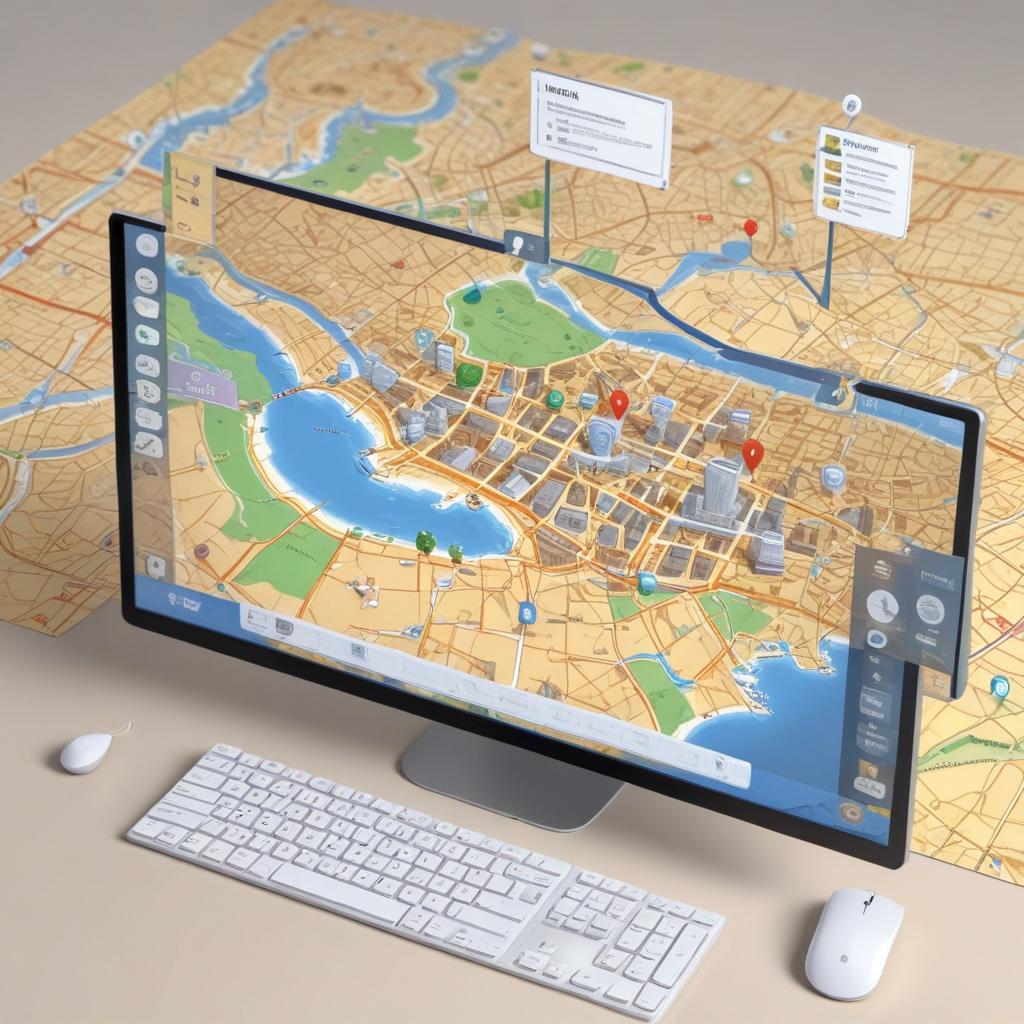
Understanding Interactive Map-Style Menus
Interactive map-style menus offer a dynamic and visually engaging alternative to traditional navigation menus. Rather than relying on basic lists or dropdowns, these menus employ a spatial, map-like interface that allows users to explore options in a more intuitive and immersive way. The concept revolves around presenting the user interface in a format that resembles a geographic or conceptual map, where different menu items are represented as clickable zones or nodes.
Unlike conventional menus, which follow a hierarchical or linear structure, interactive maps break the mold by providing a non-linear navigation design. This approach helps users to understand the relationship between different options more naturally by mimicking real-world navigation experiences. Users interact with the menu by clicking or tapping on areas within the map, which then zoom in, highlight related sections, or display additional information seamlessly. This creates an engaging and fluid experience that encourages exploration rather than simple point-and-click behavior.
The basic functionality of map-style menus is built around visibility and spatial organization. Designers use visual cues such as color coding, icons, and labels to differentiate between menu options, making it easier for users to identify what they are looking for at a glance. The interface often supports interactive elements like zooming, panning, and hover effects, which enhance user control and feedback. This level of interaction facilitates faster navigation by reducing click fatigue and improving cognitive mapping, allowing users to remember where specific items are located within the menu.
From a design perspective, map-style menus emphasize clarity, usability, and aesthetics. The user interface should avoid clutter and maintain a balance between visual appeal and functional clarity. Effective navigation design using interactive maps involves organizing menu items logically, grouping related content, and ensuring responsiveness across different devices. Designers also consider accessibility and usability principles to make sure that interactive maps are easy to navigate for all users, including those with disabilities. Overall, interactive maps transform how users engage with menus by making navigation a more visual and intuitive journey within the user interface.
Definition and Features
Interactive map-style menus are dynamic navigation interfaces that visually represent options as parts of a map, allowing users to explore and select different areas or sections intuitively. Unlike traditional menus, these menus integrate geographical or schematic visuals with functionality, making complex navigation both engaging and easier to understand. The core definition of interactive menus centers around their ability to respond to user actions within a visually rich environment.
Key features of interactive map-style menus include zooming, which lets users magnify certain areas on the map to view details more closely, enhancing usability especially in dense or information-rich maps. Panning allows users to move the map in different directions smoothly, providing continuous exploration without losing context. Another critical element is clickable areas—specific regions or icons within the map that users can select to trigger actions such as loading new content, opening submenus, or providing additional information. These clickable regions are often highlighted or animated to indicate their interactivity.
Together, these features make interactive menus powerful tools for user engagement. They transform navigation into an immersive experience, reduce confusion, and help users discover content organically. These attributes make interactive map-style menus particularly effective for websites or applications involving complex data, spatial relationships, or multifaceted choices.
Use Cases in Web and App Design
Interactive map-style menus have become invaluable tools in various sectors, offering dynamic and intuitive navigation experiences. In web design, particularly within the travel industry, these menus allow users to explore destinations visually, making trip planning engaging and user-friendly. Travelers can click on different regions or landmarks to access detailed information, itineraries, or booking options, all within a visually compelling map interface.
In app design, education platforms utilize interactive maps to enhance learning experiences. Students and educators can navigate geographic or thematic data interactively, fostering better engagement with subjects such as history, geography, and social studies. These menus simplify complex information by presenting it spatially, making educational content more accessible and interesting for users of all ages.
The real estate industry also benefits significantly from interactive maps in both web and app design. Potential buyers or renters can visually browse property listings by location, filter options, and access neighborhood details. This use of interactive maps streamlines the property search process, providing convenient, location-centric insights that are crucial for decision-making.
Overall, the use cases for interactive map-style menus span diverse fields, including travel, education, and real estate, where spatial navigation enhances user engagement. These sectors leverage interactive maps to create more immersive, intuitive, and efficient digital experiences, proving their importance in modern web and app design.
Why Users Enjoy Interactive Map-Style Menus
Interactive map-style menus have revolutionized the way users navigate websites by significantly enhancing user experience compared to traditional navigation methods. One of the primary reasons users prefer these menus is the intuitive and visually engaging interface that they offer. Unlike static menus, interactive map-style menus allow users to explore options in a spatial context, making the navigation process feel more natural and immersive.
From a usability standpoint, these menus reduce cognitive load by presenting information in a clear, organized, and visually appealing manner. Users can quickly comprehend the layout of a site and the relationships between different sections, leading to faster and more efficient navigation. This interactive approach allows users to click or hover over different areas of the map, providing immediate feedback and allowing for a more dynamic browsing experience.
Engagement is another critical aspect that makes interactive menus popular. The playful, game-like interaction encourages users to spend more time exploring content, which increases their overall satisfaction. By transforming navigation into an interactive journey rather than a simple menu click, users become more invested in the process, leading to a stronger connection with the site. This boost in engagement often translates into lower bounce rates and higher conversion rates for businesses.
Interactive map-style menus also support better orientation within a website. When users can visually track their position and see where available choices link, the potential frustration often associated with browsing complex sites diminishes. This sense of orientation contributes directly to navigation enjoyment, making the user feel more in control and less likely to abandon the site out of confusion.
In summary, the combination of enhanced usability, increased engagement, clear visual organization, and improved navigation enjoyment explains why users gravitate toward interactive map-style menus. These menus foster a better user experience by turning navigation into an enjoyable, easy-to-understand process, which ultimately benefits both users and site owners alike.
Enhanced Engagement and Interactivity
Interactive map-style menus significantly boost user engagement by incorporating dynamic navigation elements that invite exploration. Unlike static menus, these interactive designs encourage users to actively participate in the browsing experience, creating a more immersive and enjoyable interaction. The visual and clickable components of map-style menus draw attention and motivate users to click through various options, promoting deeper exploration of content.
The use of interactive design in these menus helps maintain user interest as they navigate through the map, discovering new sections seamlessly. This active participation transforms a simple navigation task into an engaging activity, increasing the likelihood that users will spend more time on the site. Enhanced engagement through such intuitive and visually appealing interfaces also improves user satisfaction and can positively impact conversion rates.
By integrating interactive elements like hover effects, zoom features, and clickable hotspots, interactive map-style menus create a sense of discovery and control. This dynamic navigation approach makes the user feel more involved and invested in their journey throughout the website. Overall, the combination of innovative design and functional interactivity ensures a memorable user experience that stands out from traditional menu layouts.
Intuitive and Visual Navigation
Map-style menus leverage visual and spatial organization to create an intuitive design that greatly enhances user experience. By mimicking real-world maps, these menus provide a clear and natural way for users to navigate through content, reducing the cognitive load traditionally associated with finding information on complex websites or applications. The visual navigation technique allows users to see the relationships between different menu items and their locations at a glance, facilitating a quicker understanding of available options.
The spatial grouping of related items in map-style menus creates a user-friendly menu environment where each section is visually distinct yet connected. This intuitive design mirrors how people naturally process visual information, making it easier for users to remember pathways and locate desired content. Users benefit from a more engaging interaction as the menu becomes not just a list but a visual guide, improving their ability to navigate seamlessly without confusion or frustration.
Furthermore, the integration of visual cues such as icons, colors, and interactive elements within map-style menus supports visual navigation by highlighting functional areas and reinforcing the menu structure. This approach enhances accessibility and usability, turning navigation into an enjoyable and efficient process, which ultimately results in higher user satisfaction and longer engagement times.
Memorability and User Retention
The engaging and unique nature of interactive map-style menus significantly enhances memorability, which directly contributes to improved user retention on websites. Unlike traditional linear menus, map-style navigation offers a visually rich and immersive interactive experience that captivates users’ attention. This distinctiveness makes it easier for users to remember where specific information or features are located, reducing cognitive load and the frustration often associated with complex navigation structures.
By providing a spatial context, these interactive experiences create stronger mental associations, helping users to recall the layout of the site more effectively. When users can effortlessly navigate a site without confusion, their overall satisfaction increases, encouraging them to return. This boost in user satisfaction is essential because it translates to longer site visits and a higher likelihood of repeated visits, fostering loyalty and sustained engagement.
Furthermore, the playful and explorative aspects of map-style menus transform navigation into an enjoyable activity rather than a routine task. This positive emotional interaction reinforces memory retention of the site’s structure, making users more likely to remember and choose the site again in the future. Ultimately, interactive map-style menus are a powerful tool for businesses aiming to create a memorable user experience that enhances user retention and satisfaction.

I’ve spent the last decade dissecting everything from classic slot volatility to the latest crash game mechanics, driven by a genuine fascination with how RNG and math drive entertainment. Whether I’m tracking tournament meta-changes or hunting for hidden features in new mini-games, my goal is to share honest insights that help players understand the games they love.